VINTAGE OWNER'S MANUALS, SERVICE MANUALS, BROCHURES AND PUBLICATIONS
Welcome to Automatic Ephemera, an independent organization/library for historical research and education, sharing public domain manuals, brochures and periodicals relating to vintage products.
Text Summary via OCR:
COLOR PLATES CHICAGO CARTON CO. AND PONTIAC ENGRAVING & ELECTROTYPE CO.
BLACK
BEAUTY
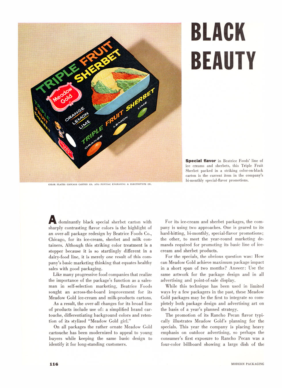
SpdOial flavor in Beatrice Foods' line of ice creams and sherbets, this Triple Fruit Sherbet packed in a striking color-on-black carton is the current item in the company's bi-monthly special-flavor promotions.
i^ dominantly black special sherbet carton with sharply contrasting flavor colors is the highlight of an over-all package redesign by Beatrice Foods Co., Chicago, for its ice-cream, sherbet and milk containers. Although this striking color treatment is a stopper because it is so startlingly different in a dairy-food line, it is merely one result of this company's basic marketing thinking that equates healthy sales with good packaging.
Like many progressive food companies that realize the importance of the package's function as a salesman in self-selection marketing, Beatrice Foods sought an across-the-board improvement for its Meadow Gold ice-cream and milk-products cartons.
As a result, the over-all changes for its broad line of products include use of: a simplified brand cartouche, differentiating background colors and retention of its stylized "Meadow Gold girl."ť
On all packages the rather ornate Meadow Gold cartouche has been modernized to appeal to young buyers while keeping the same basic design to identify it for long-standing customers.
For its ice-cream and sherbet packages, the company is using two approaches. One is geared to its hard-hitting, bi-monthly, special-flavor promotions; the other, to meet the year-round marketing demands required for promoting its basic line of icecream and sherbet products.
For the specials, the obvious question was: How can Meadow Gold achieve maximum package impact in a short span of two months? Answer: Use the same artwork for the package design and in all advertising and point-of-sale display.
While this technique has been used in limited ways by a few packagers in the past, these Meadow Gold packages may be the first to integrate so completely both package design and advertising art on the basis of a year's planned strategy.
The promotion of its Rancho Pecan flavor typically illustrates Meadow Gold's planning for the specials. This year the company is placing heavy emphasis on outdoor advertising, so perhaps the consumer's first exposure to Rancho Pecan was a four-color billboard showing a large dish of the