VINTAGE OWNER'S MANUALS, SERVICE MANUALS, BROCHURES AND PUBLICATIONS
Welcome to Automatic Ephemera, an independent organization/library for historical research and education, sharing public domain manuals, brochures and periodicals relating to vintage products.
Text Summary via OCR:
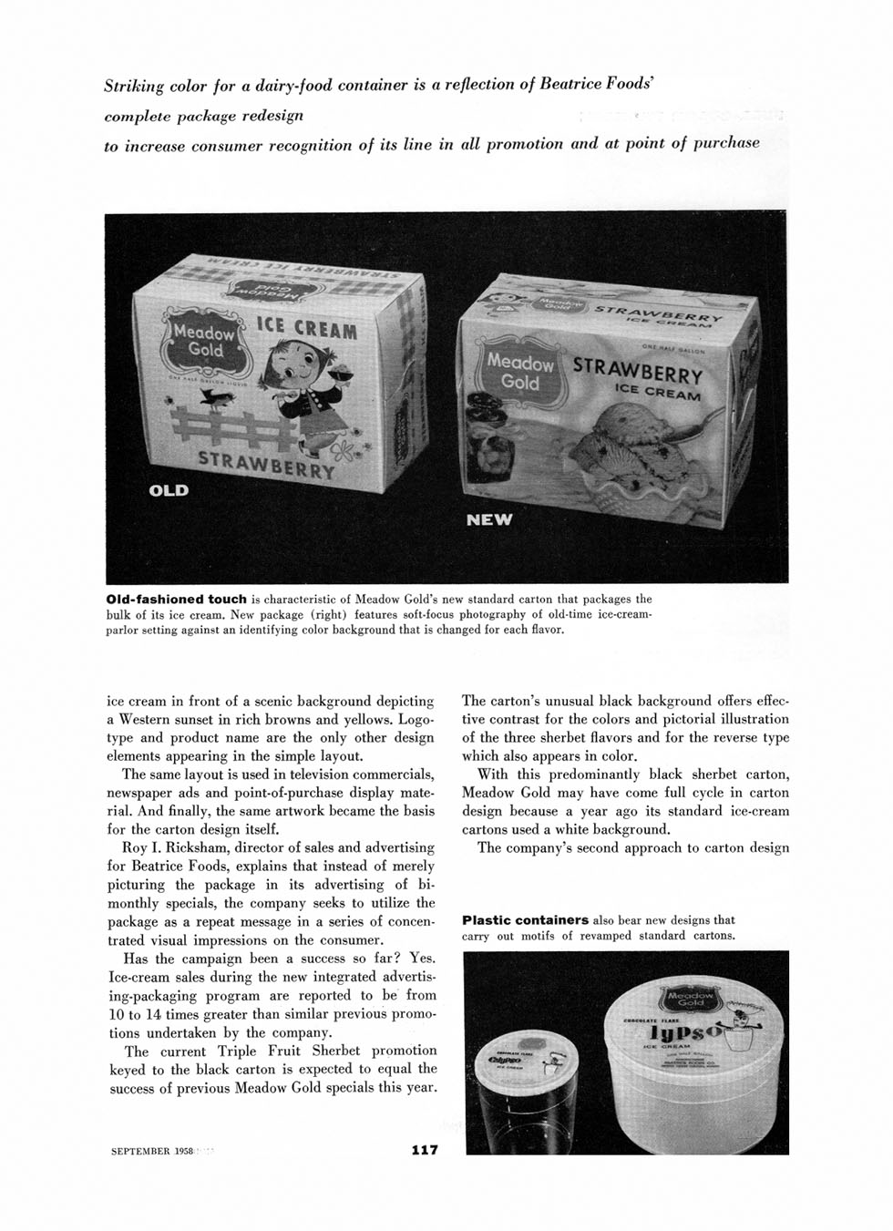
Striking color for a dairy-food container is a reflection of Beatrice Foods' complete package redesign
to increase consumer recognition of its line in all promotion and at point of purchase
Old-fashioned touch is characteristic of Meadow Gold's new standard carton that packages the bulk of its ice cream. New package (right) features soft-focus photography of old-time ice-cream-parlor setting against an identifying color background that is changed for each flavor.
ice cream in front of a scenic background depicting a Western sunset in rich browns and yellows. Logotype and product name are the only other design elements appearing in the simple layout.
The same layout is used in television commercials, newspaper ads and point-of-purchase display material. And finally, the same artwork became the basis for the carton design itself.
Roy I. Ricksham, director of sales and advertising for Beatrice Foods, explains that instead of merely picturing the package in its advertising of bimonthly specials, the company seeks to utilize the package as a repeat message in a series of concentrated visual impressions on the consumer.
Has the campaign been a success so far? Yes. Ice-cream sales during the new integrated advertising-packaging program are reported to be from 10 to 14 times greater than similar previous promotions undertaken by the company.
The current Triple Fruit Sherbet promotion keyed to the black carton is expected to equal the success of previous Meadow Gold specials this year.
The carton's unusual black background offers effective contrast for the colors and pictorial illustration of the three sherbet flavors and for the reverse type which also appears in color.
With this predominantly black sherbet carton, Meadow Gold may have come full cycle in carton design because a year ago its standard ice-cream cartons used a white background.
The company's second approach to carton design
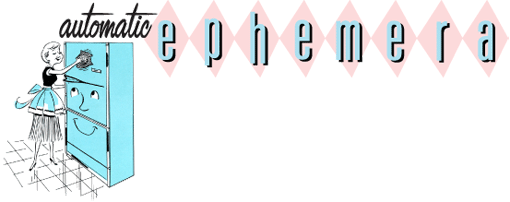
Plastic containers also bear new designs that carry out motifs of revamped standard cartons.